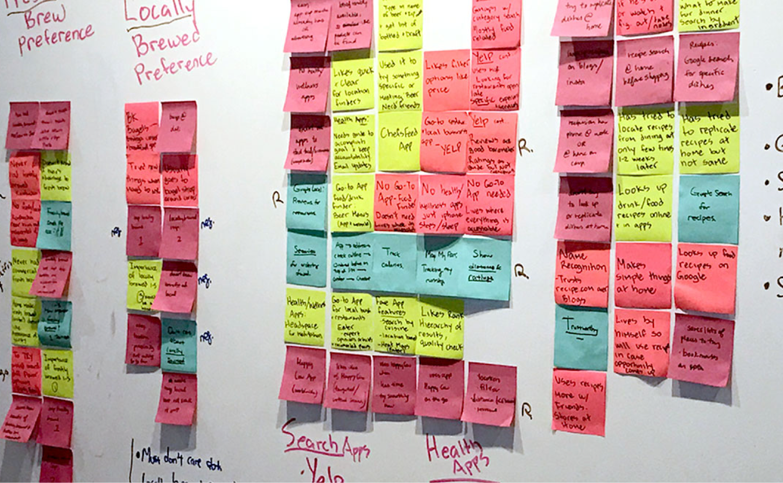
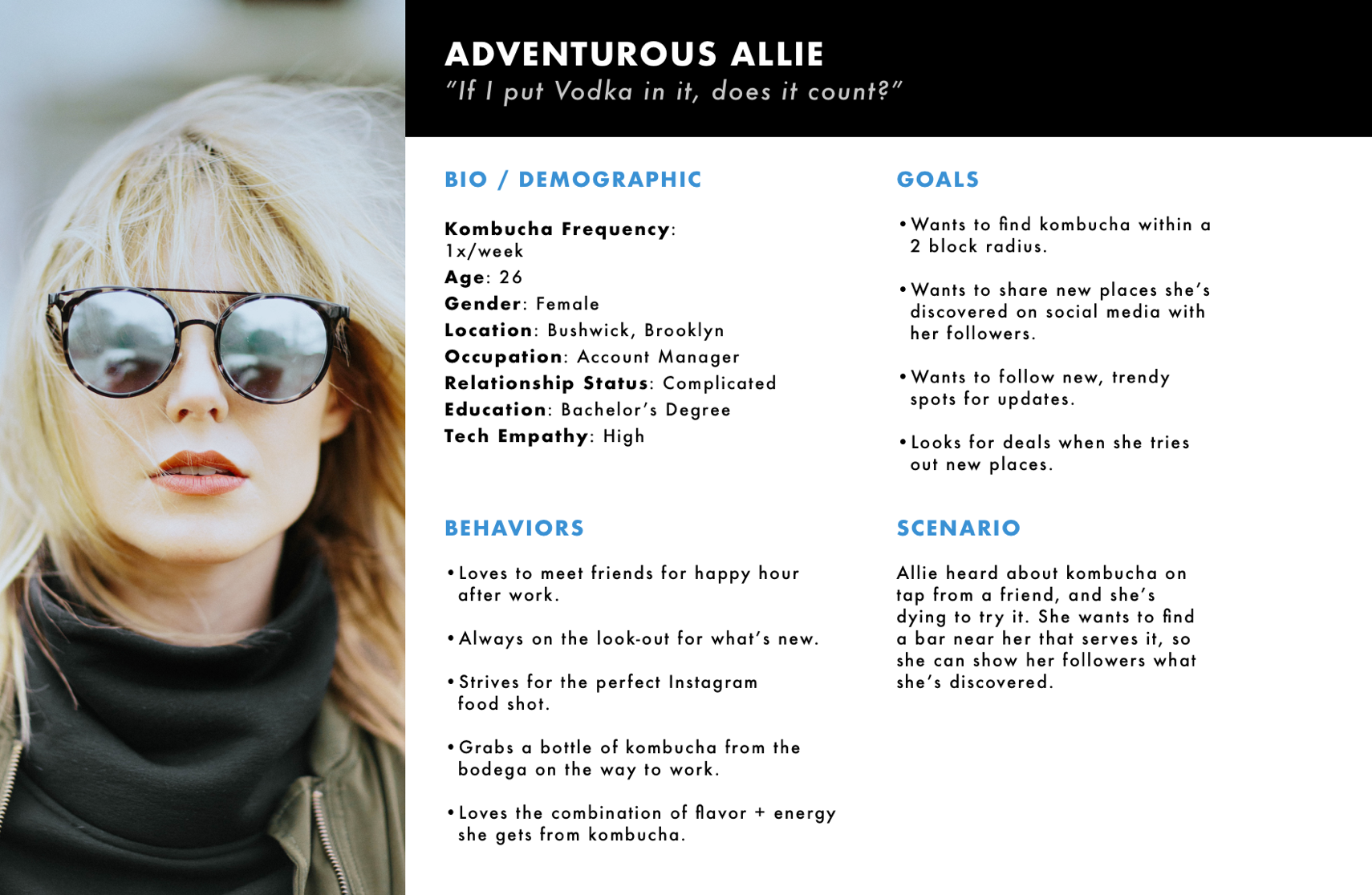
Betta Bucha
Mobile app design for kombucha locator
Summary
Betta Bucha is a startup that manufactures, distributes, and markets fresh, locally-brewed kombucha.

The mobile app intends to connect consumers with venues that serve the company's kombucha. Operating out of Miami, FL, Betta Bucha is currently expanding to NYC and places the mobile app as one of its keyarketing strategies.

The immediate project involved assessing the current v1 mobile product, and developing a redesign to fulfill the the broader community objectives.
Client
Betta Bucha
Betta Bucha
Role
designer
Lead Designer
(1 of 3)
Platform
mobile
Mobile, iOS
betta-bucha-mockup
Venue page details (above)
The Problem
In expanding to NYC, Betta Bucha seeks to target their main consumer base, the avid kombucha drinker who want to find fresh, locally-brewed kombucha nearby. The company also seeks to help them look for opportunities to connect with their neighborhood wellness and group exercise community. The question became, how might we enable these drinkers to easily find kombucha that meets their standards, and create these opportunities?
Research
betta bucha screen shot
Contextual research
First, we wanted to achieve a clearer idea of the market behind kombucha and people who drink the beverage. Thus we decided to conduct a contextual inquiry; going directly to the source of what kind of people purchase and drink kombucha.
Key findings
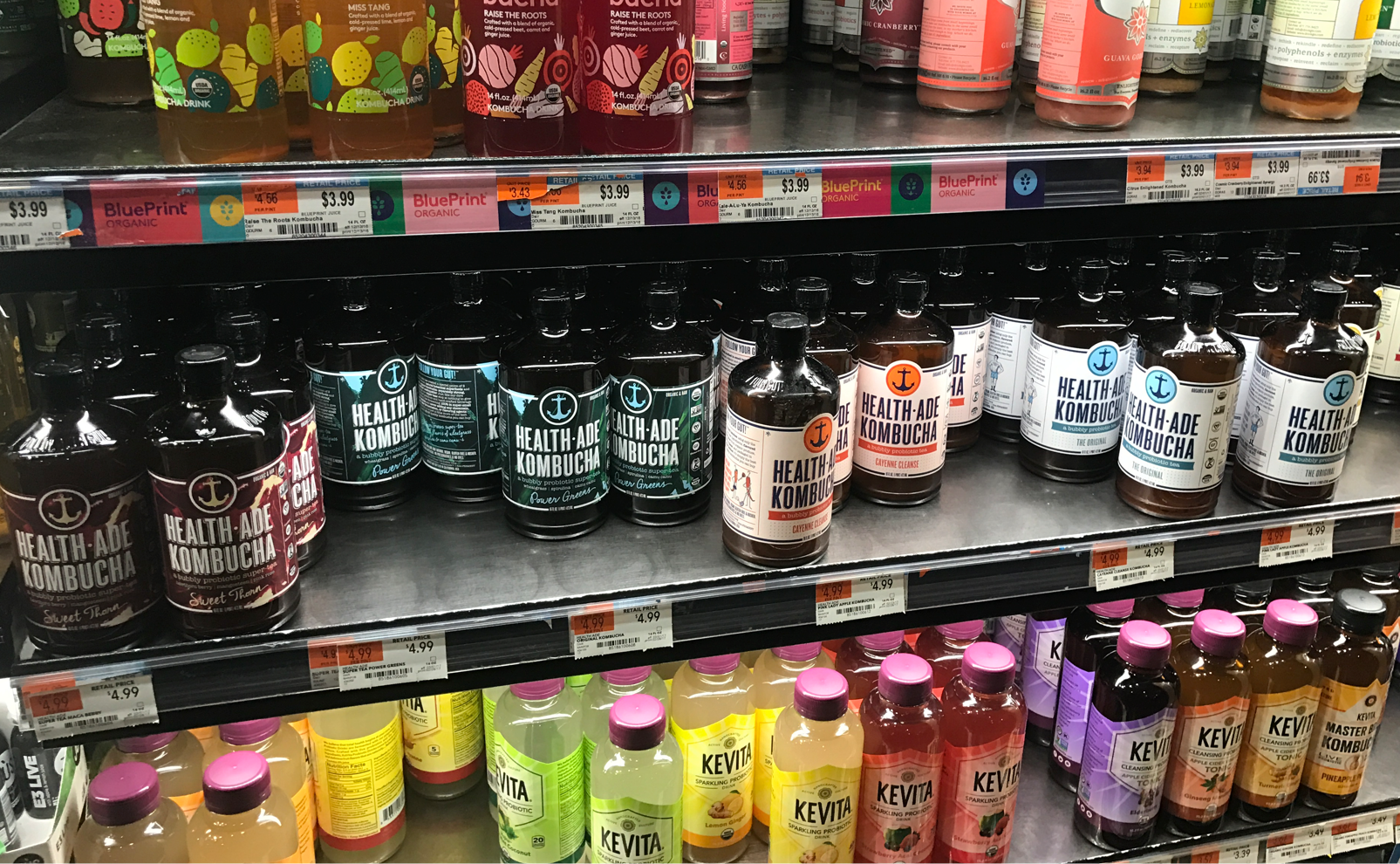
  • Kombucha was served by tap and also distributed as mass market bottles, with people preferring the bottles for convenience and price.
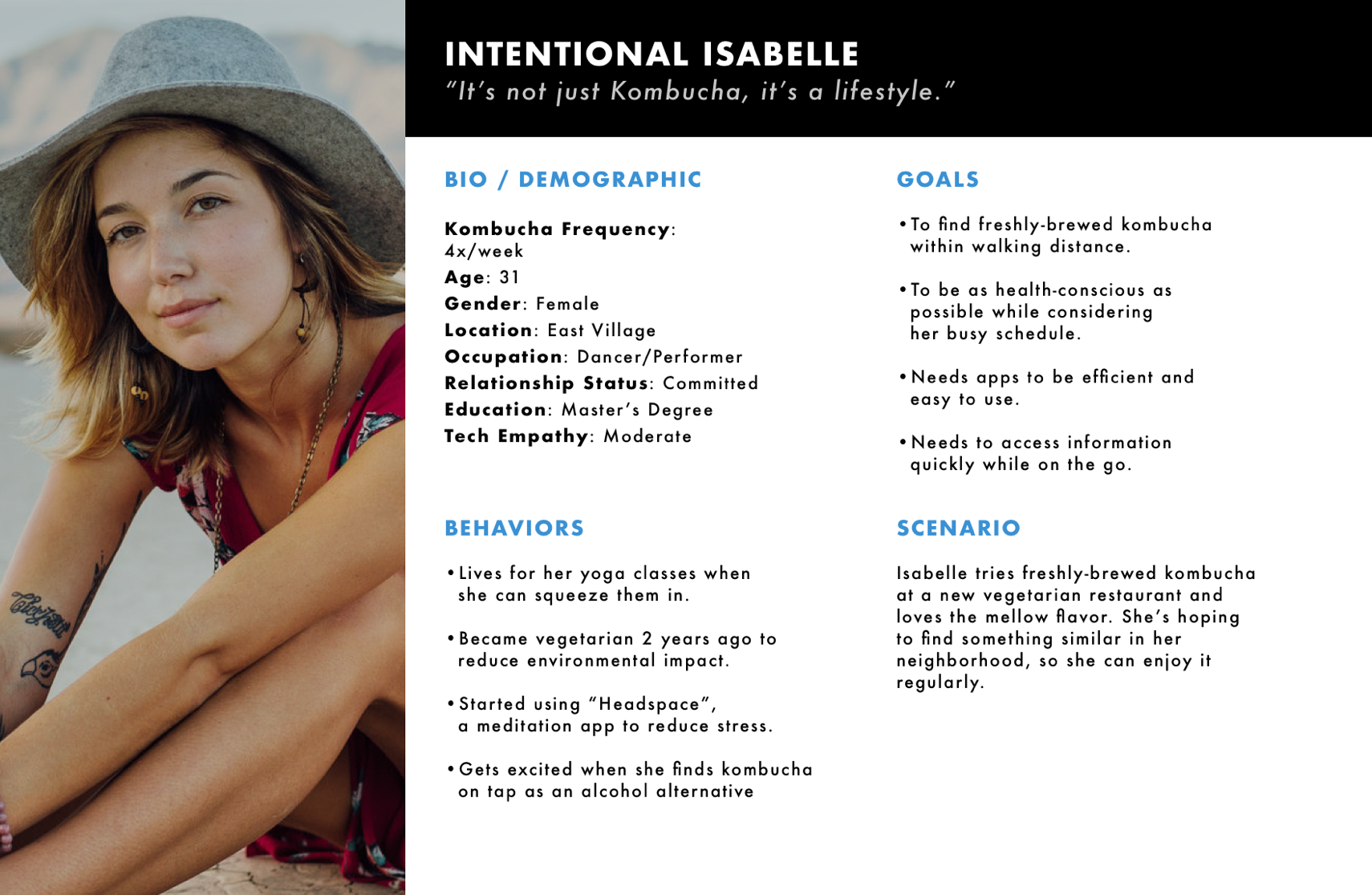
  • Observed the general demographic and atmosphere of people who frequent these establishments. It was an environment of health-conscious people with a certain degree of economic luxury, often frequenting yoga and group exercises.
betta bucha survey
Screener survey
we created a screener survey to find the closest people that would fit the criteria of being our primary users. We decided to concentrate heavily on people who drank kombucha frequently; 1-2 times a week to 1-2 times a month.
betta bucha user interviews
User interviews
After finding our users through the screeners, we conducted 5 user interviewers and synthesized findings to look for common themes / patterns by utilizing Affinity Mapping.
Key findings
  • Drink kombucha for: probiotics, flavor/taste
  • Convenience and accessibility prioritized over local/ fresh brew even for avid drinkers, due to limited knowledge of benefits and availability of fresh brews nearby
  • Currently don't prioritize local/freshly-brewed. Source for opportunity
Personas
Intentional Isabelle
Isabelle is the primary persona that we decided to target. She is an extremely health-conscious indiividual who regularly attends yoga and other group exercise classes.
isabelle
Adventurous Allie
Allie is the secondary persona that we created. She concentrates on the online social aspect, often sharing pictures of her latest drinks on Instagram.
User Testing
Existing app testing
To get a basic idea of how the current app was viewed by users, we selected 4 users to test the existing V1. They were instructed to walk through the app and tell us what they saw, what they thought the app did, and how they would use it.
Key findings
  • They needed more info about this company called Betta Bucha and its affiliates
  • 4/4 testers wanted to see an Onboarding experience or a better landing page
  • UI issues: Lightbulb icon was not intuitive for "Recipes."
Design changes
Onboarding
Users time and again expressed a desire for a onboarding experience to briefly explain Betta Bucha the company, as well as the functionalities of the app.
Improvements from testing
Simplified the language; removing excessive texts and focusing on one primary function of the app on each page.
Venue list
Users wanted to see a product finder functionality.With the current app, you can press to locate where you are, but the list does not reflect that. Furthermore, users were unaware of the filter option.
Improvements from testing
Added product finder functionality, and enlarged the visuals for each venue. Also, changed the Map from navigation to a view that you could toggle.
Events
Multiple user testings confirmed that there needed to be an additional hook besides the location finder. To tackle that issue, we decided to implement social aspects as well as business discount incentives.
Improvements from testing
“Events” navigation was initially called “Activity”, and icon was a heartbeat. User testing invalidated this form, so we changed it to a traditional calendar icon, which was then validated by users.
Venue Pages
Improved screen real estate, with better usage of icons, info, and cover image.
Improvements from testing
added “Share” function to appease the social aspects of our Personas. Made the general information clearly legible with icons, and also added the Upcoming Events tab specific for the venue.
Future steps
The team was able to deliver the new design changes to Betta Bucha on a timely deadline. The company owner was pleased with the proposed changes, and is in the process of developing the app based on these recommendations.